December 12, 2022
How to Make a Book Cover: Ideas, Examples, and Problem Points
There are many things troubling indie authors looking to self-publish, and one of them is undeniably how to make a book cover. More importantly, how to make a book cover that is both marketable and true to the art.
As you might have noticed from past posts, I have a pretty strong opinion regarding the balance between being a writer and being an artist. In a nutshell, I consider the two mutually exclusive, though in this imperfect world most of us try to find a balance between the two.
And making a book cover that supports your novel is definitely a matter of balance.
Should you go for aesthetic meaning or mere eye-catchiness? Should you prefer familiar, known solutions or something more unique, drawing attention? Perhaps the simpler the better?
We’ll take a look at these and much more in this post. I’ll share with you all I’ve learned about making a book cover that both serves its marketing purpose and respects your art. From book cover examples (drawing on my own painful experience) and ideas on how to proceed, to more general – dare I say, philosophical – problem points having to do with book covers, there’s certainly something interesting for you.
As a bonus, I’ll also share with you my most favorite book cover of all time!
What Is a “Good” Book Cover
In the context of finding the balance between marketing and art, a good book cover fulfills two functions:
- It has artistic merit consistent with the novel. In other words, it artistically supports the theme of the book.
- It improves the probability for a reader of the intended audience to select the book (i.e. purchase it or at least become interested in it).
If the above sounds a bit familiar, you’ve seen something similar in my post on how to find a good title for your novel. We have a similar situation here; it’s about balance.
The Conflict Between Art and Marketing
Before we talk about balance, perhaps we should ask: Why can’t we have the best of both marketing and art? Why do we need a balance in the first place? There is a very simple answer, one that is frustratingly accurate in our modern world of industrialized entertainment.
Marketing – selling things – is about similarity. Art – making things – is about divergence.
Though of course I’m simplifying it (hopefully not excessively; I’m far from being a marketing specialist), when you sell a book, you try to convince people that they will like it as much or better compared to other books they’ve read. This is also where genre enters the picture: It’s a marketing tool that helps authors situate their book alongside other works.
All this is strongly about similarity and comparison. Perhaps you’ve even seen books advertising themselves as “For readers who liked [X author or Y novel]”.
Art, on the other hand, has virtually nothing to do with any given audience. The artist doesn’t try to sell anything. A true artist wants to create something new – or better: to mediate an experience in a unique, authentic way.
What this key difference indicates is that a book cover, like every other aspect of a book, cannot be at the same time profoundly artistic and super-efficient from a marketing perspective. Which means, we need a balance.
So, how do we find it?
Finding the Balance when Making a Book Cover
Obviously, the balance point when making a book cover will depend on your priorities. That is, whether you favor artistic expression or marketing results. Generally, the more you favor the latter, the more you should aim for consistency and similarity to the rest of the books in the given genre.
This applies to all individual aspects that make a book cover:
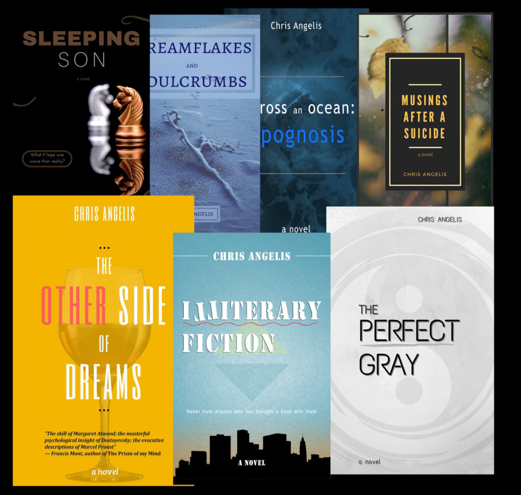
- Content, both textual and visual. What is written on the book cover, as well as what visual elements it contains. Most typically, those are the title and the author’s name, as well as a photo and some decorative elements (see below). However, depending on the genre, technical limitations, and the ever-moving target of balance we’ve talked about, there can be some really imaginative options here. I’ll give you an example later, when sharing my most favorite book cover of all time.
- Font choice. This is fairly straightforward. Font choice is one of the most visibly similar aspects within a certain genre. Romance fiction? Cursive, romantic font. Science fiction? Hard, sharp font. Also the way font is combined can be both artistic and relevant to the genre and question – notice the way I’ve spelled “Illiterary” on the cover of Illiterary Fiction (see image above) to see what I mean.
- Images and decoration. Much of what makes a book cover is the visual element, that is, a photo (or more) and any decoration – this refers to everything decorative. Once again, look at the cover of Illiterary Fiction and notice the wavy red underline, the triangles simulating elevator indicators, and even the white line around my name. All these are decisions that affect both artistically and marketing-wise.
- Colors. Hugely important element; colors can make or break a cover. How many pastel-colored horror books have you seen?
- Placement and layout. This refers to the way everything is combined together. Looking at my book covers, you’ll notice a very traditional, easily relatable layout. Certain books can favor very different layouts, which can be a very daring approach. Overall, the way everything is put together is one of the most traditional elements in a book cover. To put it bluntly, the more you experiment with this, the more you risk alienating your audience.
Some Quick Examples
A picture is worth a thousand words, they say. So here are some random examples I pulled from Canva. They are two versions of the same basic idea, to show how differing elements can produce a wildly different affective result (both in terms of marketing and artistically!)

Color is crucial, and so is font, when it comes to communicating genre. The second example is obviously “off” considering what the genre of the book appears to be.
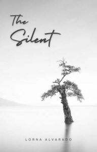

In most cases when it comes to making a book cover, less is more. This is especially the case when the novel revolves around minimalism (“The Silent” in this imaginary example).

Placement and layout is where you can get very original. This can be artistically intriguing, opening up all kinds of possibilities, but also very risky.
Making a Book Cover: Some Problem Points
I once saw someone online advising a rather radical solution for a book cover: Don’t do anything, they said; simply use a black background and the biggest white font for the title. That’s it.
Though I don’t agree with the suggestion, I totally see where it’s coming from. We live in the era of mediocrity, and that applies to writers as well as readers. In other words, I see why that person suggested such a thing for a book cover, if the goal is simply to draw attention.
Should it be?
This is an ideological matter; a philosophical one, perhaps. Do we want fiction that is art or entertainment? If there is even an iota of artistic essence in there, I believe a book cover’s job is not simply to draw attention.
A book cover is part of the novel: It should communicate more than just “pick me”. Rather, the way perhaps a synopsis does, it should also show how it would feel reading that book. And that invariably involves art.
My Favorite Book Covers
I do have something in mind for my most favorite book cover of all time – quite a grand statement, I know. But it’s an incredibly intelligent book cover, as we’ll see.
But before we get there, I want to pick my favorite among my own books.
As I’ve said before, my covers won’t, ever, win any awards. To some extent, I see them as a sort of necessary evil. Still, I do have artistic ideas when it comes to making a book cover – whether I’ve executed them well or not is another matter.
With this in mind, the covers for Illiterary Fiction and The Perfect Gray are my favorites. I’ve clearly become better in making covers, too; the covers for my early books are far less inspiring. But Illiterary Fiction and The Perfect Gray work because they are artistically consistent with the work in question.
In other words, as I said earlier, they make the prospective reader feel what it would be like reading the book, also containing references to events and elements inside the novel.
My Most Favorite Book Cover of All Time
And so, we’ve reached the moment when I reveal the book cover I consider my most favorite. It’s The Raw Shark Texts, by Steven Hall.
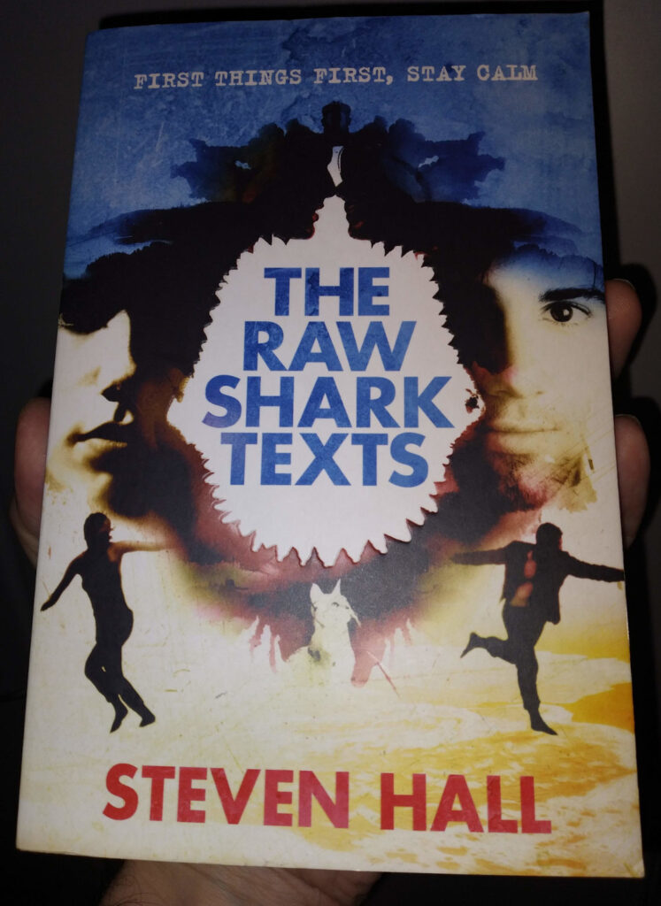
Ideally, you should’ve read the book to properly understand why I consider it so intelligent – also feel free to read my reference to it (and see the related video) in my post on experimental fiction – but briefly:
- The basics are fine marketing-wise: The overall design (fonts, colors, visual elements) succeeds in communicating the genre of the book.
- In a novel having to do with reality and our interpretation of it, having an inkblot test as part of the main image (also, in a celebration of duality, featuring the two main characters – twice!) is very, very intriguing. By the way, you might know that inkblot tests are also called Rorschach tests. Keep pronouncing “The Rorschach tests” and let me know if you see yet another reality-behind-reality in there.
- Inkblot, sharks, reality within reality. Do you see yet another image there in the center? What does it look like? I’ve also tried with my photo to show that the design is de-bossed, creating the illusion that there’s “something” coming out of the page. May I remind you that The Raw Shark Texts is about a man being in a world where words and text can take the form of a conceptual shark and kill you.
As it becomes apparent, The Raw Shark Texts cover operates on many levels at the same time. That’s a highly artistic ideological standpoint.
I could talk about the book cover – and the book! It was among my favorites when I taught Gothic fiction – for hours, but you get the idea. A successful book cover can bring marketing results while it stays true to the art. More honestly, however, we should underline a simple fact: It’s not about “staying true to the art” as it is about highlighting the artistic merit of the novel itself. Without art in the novel, any book cover art is mostly meaningless.
And so, perhaps we have reached a grand conclusion.
In the end, finding the balance when making a good book is a holistic process. Artistically intriguing novels can benefit from artistic covers. Otherwise, the cover of a money-making text might as well be a black background with large white font.
4 Comments

Comments are closed for posts older than 90 days
I really enjoy the second Silence book cover better than the minimalist one. Dreamflakes and Soulcrumbs certainly looks generic. The others are fine, each in their own way. Despite all the explanation, minimalistic book covers still win my heart much better than The Raw Shark Texts. There was a late 1960s Brazilian short story book which had the first story start on the front cover and follow immediately inside. What a great book it was.
To each their own, as they say!
Covers ARE an important topic. But which ones are ‘good’ gets a little fuzzy, once past the obvious horrors.
Possibly last, but not least: the cover is a package with the text, and, for SPAs, REPRESENTS the author, regardless of how much help the author requires or chooses to have.
Authors can be very wrong, and most of us are minimally artistic (compared to ‘real’ artists), but we know our own BOOKS better than anyone can, and it’s OUR choice – the consequences of which we live by. I find the whole process fascinating – and am not, since I don’t write genre fiction, interested in opinions from those I haven’t asked. Whether I keep the set I want for my mainstream trilogy, or decide it’s hurting sales (you can’t hurt sales until you have SOME discoverability), the choice to illustrate a scene from the book that might make a reader wonder about the story is one I’ve made and will stick with for now – and not reconsider at least until well past the third book is published (because I can see that one in my mind).
My early attempts were the basis of learning – some – with a mentor whose covers I liked (who turned out to have very strong opinions and solid basics).
In traditional publishing, only highly paid authors get much say, graphic artists are not readers, and the control lies elsewhere. I wonder how much that will change as trad pub fades.
Right now, if I never see another Romance cover, I’ll be happy, or another ridiculously bare-skinned warrior or little woman with her kidneys easily sliced.
I don’t have the bandwidth to worry about it now – except for having very definite ideas and being relatively happy with the results. And knowing I have the ability to change when I choose.
You’re raising some excellent points. And please, yes, no more romance covers. I’d also say “no more romance fiction”, but likely it’s too much to ask.
I have published one book the cover of which was chosen by someone else, and I could say nothing beyond “I like it”. I’m of course referring to the traditionally published novel of mine, which I’ve sort of disowned. It wasn’t a bad cover from an aesthetic perspective; certainly much better than the art of the book. But that’s what made it, ultimately, a “bad cover”: It promised something the book was not.